small medium large

Guidance for Developers

Small Medium Large is designed for Webflow developers who need a flexible system that doesn’t compromise on build speed.

Small Medium Large is highly adaptable to any design, while still offering a range of predefined classes to ensure a quick start. It maintains a clean, Webflow-native structure without requiring large amounts of custom code.

One aspect that might not appeal to everyone is that the framework avoids using margins or paddings, relying instead on spacer divs. This approach enhances clarity in the Navigator, as margins and paddings are not buried in combo-classes but are immediately visible within the navigator panel.

The naming convention of Small Medium Large following the logic of XL, L, M, S, and XS. It is used to define text sizes, spacing, shadows, breakpoints, and component blocks. A clear system that can easily be expanded upon with additional classes if a design calls for larger or smaller elements.

This framework does not put the client first, nor the developer. It puts efficiency first. It puts you in control while also providing your client with valuable insights into its inner workings and the ability to extend their website with additional pages.

The Global Styles custom code component should be included at the top of every page—using the Starter Page Template can save you the hassle. This component, among other things, defines fluid scaling. This approach streamlines the development process by eliminating the need for additional larger breakpoints, and layout changes for tablet screens typically being sufficient too.

How scaling is handled depends on the screen size specified in the design file. Therefore, you must choose the version that matches the design. In all cases, 16 px in the design is equal to 1 rem.

Designed on 1920 px

Scaling in this version of the SML framework is defined for viewport widths ranging from 1920 to 1280 px. Between 1280 and across tablets there will be no scaling.

On a 1920 width 16 px is 1 rem, on mobile landscape 16 px is again 1 rem.

The designer needs to ensure that the main text size doesn't scale down below 16 px. As an example, a 24 px font size in a design made on a width of 1920 will scale down to 16 px on a tablet. It will not scale up on a screen larger than 1920.

Webflow Cloneable L - 1920px

Designed on 1680 px

Scaling in this version of the SML framework is defined for viewport widths ranging from 1920 to 1280 px. Between 1280 and across tablets there will be no scaling.

On a 1680 width 16 px is 1 rem, on mobile landscape 16 px is again 1 rem.

The designer needs to ensure that the main text size doesn't scale down below 16 px. As an example, a 21 px font size in a design made on a width of 1680 will scale down to 16 px on a tablet and scale up to 24 px on a 1920 screen and larger.

Webflow Cloneable M - 1680px

Designed on 1440 px

Scaling in this version of the SML framework is defined for viewport widths ranging from 1920 to 1280 px. Between 1280 and across tablets there will be no scaling.

On a 1440 width 16 px is 1 rem, on mobile landscape 16 px is again 1 rem.

The designer needs to ensure that the main text size doesn't scale down below 16 px. As an example, an 18 px font size in a design made on a width of 1440 will scale down to 16 px on a tablet and scale up to 24 px on a 1920 screen and larger.

Webflow Cloneable S - 1440px


If you got handed a design that does not accommodate any form of scaling or if you prefer to adjust it by hand, then simply remove this function, it is the first chunk of code in the Global Styles Component.

   Layout

The layout system used in Small Medium Large is nothing new, based on the 12‑column principle.

A layout row with left and right negative margins and inside that columns with left and right side padding to create the gutter and a width set in percentages. The size of the gutter is set inside the variables panel.

Add a flexbox layout to control the elements inside a div

More ready‑made classes turn an element into a flexbox and add control to the placement of the elements inside it.

All classes that are used for layout start with layout__
Each class is well‑named, leaving little to the imagination.

See the Layout Classes Sheet
layout__col
layout__vertical
layout__align-center
layout__justify-space-between
layout__col-3

Predefined classes give you full control across all breakpoints

Small Medium Large is not built to save a few seconds of your time. When it comes to choosing between automation or giving you control, we choose control.

This framework will not automatically turn your 4‑column layout into a 2‑column layout for tablets or a 1-column layout for mobile. No, you determine the layout changes for each breakpoint by adding the matching class name. Maybe a 3‑column layout on tablet is better and does the content still fit nicely in a 2‑column layout on mobile? It's up to you.

The classes that target a specific breakpoint start with bp‑s__ for tablet, bp‑xs__ for mobile landscape, and bp‑xxs__ for mobile portrait. There are no predefined classes for the optional bigger breakpoints, but if you need them then you can name them using the same logic: bp‑l__, bp‑xl__, and bp‑xxl__.

See the Responsive Classes Sheet
layout__col
layout__vertical
layout__align-center
layout__justify-space-between
layout__col-3
bp-S__layout__col-4
bp-XXS__layout__col-6

   Spacing

Small Medium Large does not have a system for using margins or paddings, instead, it uses separate divs to create space between elements, ranging from spacing‑xxs to spacing‑xxl.

Square div blocks are helping to keep a consistent use of whitespace

The problem with using margin and padding combo classes is that their names are not shown in the navigator, and therefore it is all too easy to be inconsistent in your use of space across a website, especially over time when a website grows and new pages need to be added.

Therefore with this approach we can now right away see in the Webflow Navigator the spacing elements with their class indicating the size.

All sizes can be easily adjusted inside the variables panel.

See the Layout Classes Sheet
Screenshot from Webflow Navigator panel showing the different spacing classes.

   Typ

The headlines and text sizes are of course also named according to the Small Medium Large logic.

H1 is the same as heading‑xl and H6 is identical to heading‑xxs. And for plain text is the body equal to text‑m and from there, we go up to text‑xxl and down to text‑xs.

There are predefined classes for text alignment, you can have text‑center for desktop and bp‑s__text‑left for tablet.

See the Typ Classes Sheet
heading-xl
E
C
B
heading-l   
D
N
L
F
heading-m 
P
T
E
O
R
heading-s  
F
Z
B
D
U
E
heading-xs 
L
C
P
T
Z
Z
E
heading-xxs
U
E
B
D
P
H
C
F

   Color

The Small Medium Large starter doc already has color variables defined, split up into a base, primary, and secondary sets where primary‑500 and secondary‑500 are the brand colors. Needless to say, you will have to change the colors to match your brand inside the variable panel.

There are predefined background color classes for all tints. And for text colors, you have the base and brand colors preset.

Shadow elevation levels

To make life just that little bit easier the starter doc also comes with 6 predefined levels of shading. The highest level aka biggest shadow is shadow‑xl and from there we work our way down to the lowest level, being shadow‑xxs.

See the Color Classes Sheet
Screenshot from Webflow Variables panel showing the color setup

   Components

Pre-Builds


A variety of pre-built, fully responsive basic layout components accompanies the Small Medium Large Framework. They will empower your clients to create new pages the moment Webflow releases Build Mode. Customize them if needed to match the brand design and layout varieties.

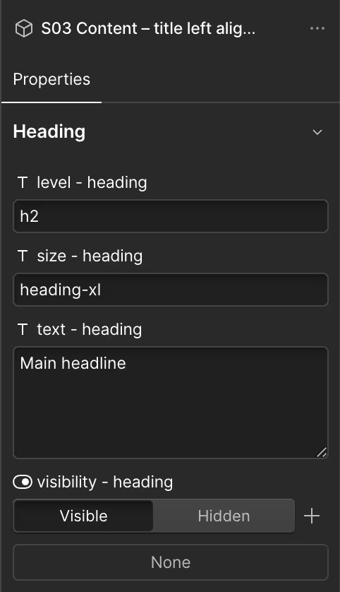
Each component comes with customizable properties that allows for changing text, images, text size, header levels and visibility of certain elements without the need to break the component.

Intentionally, you won't find more complex designs here—no navigation bars, footers, or tab sections. These elements vary too much from one design to another and cannot be standardized without turning this into a template.

See the Pre-Builds Sheet

Component Blocks


Aside from fully Pre-Build components Small Medium Large also comes with component blocks. These slot into each other like Matryoshka Dolls, enabling an endless variety of layouts.

Each layout can be broken down into three levels:

  1. L‑component: This is placed inside the page wrapper that is already present on the page template and forms the outer wrapper for each layout section.
  2. M‑component: Inside an L‑component, you can include as many M‑components as needed to build a layout, each forming a single column. For instance, the variant 4|2|1 means it holds a single column of a quarter width on desktop, half-width on tablet, and full-width on mobile.

    For example, you could use two M-components set to 4|2|1 and one set to 2|1|1. This will result in a desktop layout of a single row with two quarter-sized columns and one half-sized column. On a tablet, it will create two rows: the first with two half-sized columns and the second with one full-width column. On mobile, you will have three rows, each with a single full-width column.
  3. S‑components: Inside each M-component, there is a slot for S‑components, which holds all the visual content such as headlines, paragraphs, images, and buttons. These come with properties to change text, text size, and visibility. For headlines, you can also adjust the header levels (h1, h2, h3...).

    S01 - Section is for creating more complex layouts, it enables you to divide an M‑component column up with other M‑component columns. This allows for, for instance, three columns inside a two-column section.

    S02 – Tabs & S03 – Slider are components that allows you to populate tabs or slides directly in Build Mode. These are displayed below each other in Webflow, making them available to edit. On the published page, they appear as standard tabs and slides.

While it can quickly become complex, remembering that M‑components form a single column in your layout will help you get the hang of it quickly.

Only when you are inside Webflow do empty slots appear as boxes with a red dotted line around them.

See the Component Blocks Sheet